The art of visualization
Some time ago i published my last blog about machine learning. I talked about predictive models and the concept of machine learning. Now, it’s time to see what the next step is after building a predictive model. You need to use the model and visualize its results. Right?
Let’s see then how we go about visualizing now that we’ve generated the first predictive dataset from our model.
Picturing things in your head is just the beginning of the process
Before we start creating visualizations to communicate our findings, we must think about what we do next in order to make our vision more effective. We need to picture the story in our head before we start building or creating visualizations. As I did in one of my previous blogs, I’ll again use a food analogy; Before you start cooking a dish, you need to picture how you will plate it. What should the end result look like?
In that way, you have a goal to achieve! In our case now, we need to visualize the story in our head first, or even draw it on a piece of paper.
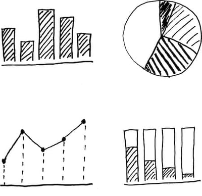
I like to draw circles, bar charts, pies, boxes or even simple figures at the beginning. Just lay out my ideas into a traditional two-dimensional way. I am not worried about neatness at this point. I am just drawing lines to make connections and add information to my drawings. Then, I am using these drawings, these pictures, to start creating my story and start asking questions to myself like “What needs to be adjusted?”; “What needs to be added or taken out?” By answering those questions, you achieve something important. It allows you to make your visualizations simple and informative. That is the ultimate goal!
Selecting the right way to visualize your data
At this point we have an idea of how to tell our story, of how to present our results based on the drawings. But are all these visualizations the right ones?
Picking up the right visual is not always as simple as it seems. In most cases, you should put some thinking in the selection of the visual. By selecting the wrong visual, you may lead your audience to wrong assumptions. There are many examples showing that a wrong use of visuals may mislead you and derive the wrong results. Apart from the selection a wrong type of graph, the use of colors is also a factor that can lead to misinterpretations and confusion. For example, take a look at the image below.
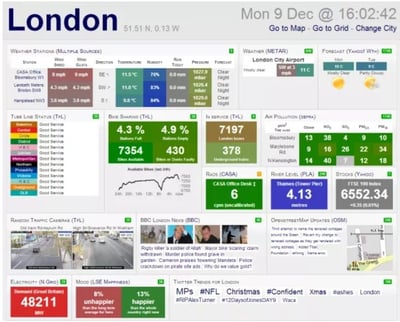
Any idea what’s going on in London…? I certainly don’t. As you can see, this is an example of way too many graphs being stuffed in one overview. The abundance of colors doesn’t make it any easier to read either. There are too many tiles showing numbers and percentages that makes the dashboard complicated and misleading. Big rule of thumb when it comes to visualizing: simplicity is always better. Check the dashboard below to see the difference. Very organized, no bright colors and less information in one view.
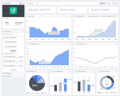
This dashboard is a good example of how to make a simple and easy-to-read dashboard. This is our goal. I have said in the past and I will repeat it here: no matter how good of a data scientist you are, if you don’t present your findings in a meaningful and understandable way, then the result is not what you expected it to be. Simple as it sounds, you have wasted your time. Because nobody will be able to see what you see in the data. Nobody will be able to make right decisions if the visualizations are misleading. So it is very important to select the right visual to communicate our findings.
Tell your story without words
We’ve agreed that doing some thinking and preparation before we start designing our dashboard and choosing the right visualization are the right steps towards a successful result.
Using the right description and correct titles on the charts is beneficial as well.
We don’t need to include a whole paragraph to explain what we see in a visual. Neither the reader should have to guess what he or she sees in the visual. This could lead straight to misinterpretation of the information we are trying to present. That’s why we need to use the right description or titles in a graph. I will say it again and again: the simpler the better. You probably have already heard the phrase: “If you have to explain it, it’s not good enough.” It doesn’t have to be complicated to be good.
Is piechart the right chart to use

One last thing I would like to mention, is pie charts! You might have already read in other blogs or articles that it’s “not OK” to use pie charts. I beg to differ, because sometimes pie charts are informative. In general, yes, we try to stay away from pie charts as much as possible, as they can be quite unclear to the reader. The human brain is not designed to compare angles, but can handle the comparison of lengths much easier. That’s the main reason not to use pie charts in general. And even better, in my opinion, donut charts are better than pie charts. Someone may wonder “What is the difference between a pie and a donut?”, apart from the fact that they have different dough. Donut charts are better in a sense that they can contain more and clearer information. They are also easier to read since we compare lengths and not angles any more. See the example below.
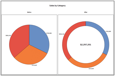
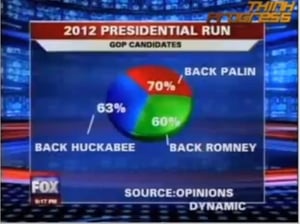
Lastly, if you want to use pie charts, at least make sure not to break the number one rule: the total must add up to 100%. See the example below.
Although we try to avoid pie charts, there are some cases we can make good use of it. One of those cases could be when we can use a pie chart as a slicer for our visualizations. What I mean by that; We can use a pie chart to select underlying information. In simpler words, to filter out data. I will give you an example.
Imagine you have information of a company, like number of employees per manager, per department, per gender. You can use a pie chart showing the employees grouped by gender. By using this specific pie chart as a slicer in your data you can immediately see how many men and women you have in the company. In addition, by selecting for instance women, you can see all the information about women of the company. So, you get an overview of employees based on their gender and at the same time you can save space in your dashboard by using the very same visual as a filter. There you are, you have just learned another way to use pie charts.
Why visualization is an art
Before I finish this blog, I wanted to summarize and explain why visualization is an art.
Visualization is a form of communication. We use data, we create predictive models, but we need to show and communicate the results. Right? There is not always an easy way to do it.
That’s why we need to find the best way to communicate our findings. I believe that the selection of the right graphs, colors and descriptions is an art! It’s not easy, it’s not simple to do and not everyone can do it well. Exactly like art. It’s not easy or simple to create art, no matter in what form; a painting, a poem, a movie. Not everyone can do it, even if it seems sometimes easy.
You need to be an artist to create amazing visuals or dashboards, which is meaningful and useful to the reader.
I hope you had fun and maybe learned something new by reading this blog. Don’t hesitate to leave your comment if you agree or disagree with me or even if you want to suggest another topic for me to write about in my next blog. Stay ahead!